The Power of Nothing: How Intentional Emptiness Becomes Architecture's Most Sophisticated Statement
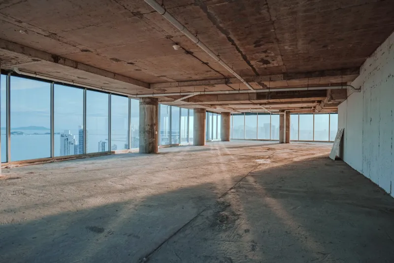
There is a particular anxiety that grips developers, clients, and even some architects when they encounter an empty room. The instinct is immediate and almost universal: fill it. Add a partition, install another workstation, drop in a feature wall. American commercial real estate culture has long operated on the premise that unused square footage is wasted square footage — a liability dressed as design.
But the most enduring, most admired spaces in contemporary architecture tell a different story. They tell it quietly, in the language of restraint.
Negative Space Is Not Absence — It Is Presence
In visual art, negative space refers to the area surrounding a subject — the deliberate emptiness that gives form to what exists. Architecture borrows this concept and extends it into three dimensions, where the stakes are considerably higher. A void in a building is not merely aesthetic. It is experiential. It shapes movement, governs attention, and communicates institutional character in ways that no material or finish specification can replicate.
Consider the entry lobbies of major financial institutions in cities like New York or Chicago. The most prestigious among them are not the most ornate — they are the most spacious. Soaring ceilings, minimal furnishings, and wide-open floor planes do not suggest inefficiency. They suggest authority. The message is architectural: we have so much that we need not fill every corner to prove it.
This is the psychology at work. Strategic emptiness signals confidence. It tells a visitor, before a single word is exchanged, that the organization within is not scrambling for every inch of relevance.
Cognitive Load and the Case for Breathing Room
Beyond symbolism, there is a neurological argument for designed voids. Contemporary research in environmental psychology consistently demonstrates that visual complexity — too many surfaces, objects, colors, and competing focal points — elevates cognitive load. The brain processes every element it encounters, and in densely designed environments, that processing never ceases. The result is a subtle but cumulative fatigue that most people experience without being able to name its source.
Strategic emptiness interrupts this cycle. An open volume, a bare wall, an unobstructed sightline — these are not design failures. They are rest stops for the mind. In workplace environments particularly, where sustained concentration and creative output are the entire point of the architecture, this matters enormously.
Some of the most progressive corporate campuses built in the last decade have incorporated what designers call "decompression zones" — areas with minimal programmatic content whose sole purpose is to allow the nervous system to reset. These spaces are not conference rooms in disguise. They are not informal collaboration hubs with aspirational furniture. They are, by deliberate design, nearly nothing. And they perform precisely because of that.
What Was Not Built: Case Studies in Restraint
The discipline of choosing not to build is harder than it sounds, particularly in a client relationship where square footage carries a direct dollar value. Yet several landmark American projects demonstrate how powerful that discipline can be.
The renovation of a major Pacific Northwest technology campus several years ago included a decision to leave a central courtyard entirely unprogrammed — no seating clusters, no water features, no branded installations. The space was simply open lawn, framed by the surrounding structures. Initially, the client expressed concern that the area would feel underutilized. Within months of occupancy, it had become the most organically active space on the entire campus, precisely because it placed no demands on the people who entered it. The void created permission.
Similarly, a boutique financial advisory firm in Boston chose to eliminate a planned secondary reception area during a headquarters renovation, leaving instead a wide, unhurried corridor between the elevator bank and the primary meeting suite. The passage, lined with a single material — honed limestone — and lit from above, became the defining spatial experience of the project. Clients regularly comment on it. The firm cites it as a differentiator in first impressions. Nothing happened in that corridor. That was the point.
The Luxury Signal
In commercial design, emptiness has become one of the clearest markers of premium positioning. Retail environments offer perhaps the most legible version of this principle. The most exclusive boutiques — whether in Beverly Hills, on Madison Avenue, or in the emerging luxury corridors of cities like Nashville and Austin — present their merchandise with radical spatial generosity. A single garment on a single rack. A solitary object on a plinth. Wide expanses of floor between fixtures.
This is not inefficiency. It is deliberate communication. The message is that the objects within are important enough to breathe. And by extension, so is the client who has come to consider them.
The same logic translates directly into professional service environments — law firms, wealth management offices, medical facilities catering to high-net-worth clientele. When every surface is filled, every wall adorned, every corner activated, the environment communicates urgency, effort, even anxiety. When space is allowed to exist for its own sake, the environment communicates ease. Mastery. The kind of confidence that does not require constant demonstration.
Overcoming the Fear of the Void
For architects advising commercial clients, one of the most important conversations is often the one about what to leave out. This requires a particular kind of advocacy — the ability to articulate the value of restraint to clients who have been conditioned by the real estate industry to measure success in density.
The argument is not sentimental. It is functional and financial. Spaces that communicate calm, authority, and generosity attract and retain the kinds of clients and tenants who generate long-term value. They reduce employee stress and improve the quality of work performed within them. They photograph well, which matters in an era when architectural imagery circulates through social channels and shapes reputation before a prospect ever steps through the door.
Perhaps most importantly, they endure. Maximalist environments date quickly. Restrained ones do not. The void, it turns out, has a remarkably long shelf life.
Designing What Is Not There
The most sophisticated architectural question is not always "what should go here?" Sometimes it is "what would happen if nothing did?"
At Gab de Arq, the discipline of negative space is not treated as a concession to budget or a failure to program. It is treated as a design instrument — one that requires as much intention, precision, and craft as any material selection or structural decision. The absence of something, designed with care, is not emptiness at all.
It is architecture at its most deliberate.